OsmAnd 2.0 (Android)

We are glad to announce that OsmAnd 2.0 is coming to devices. We expect to finish the rollout on this week. This has been a while we had to admit that OsmAnd didn't follow the guidelines and had an inconsistent UI.
This major release we fully focused to put the most trending UI, Material Design, in place. Meanwhile we considered dozens interactive patterns to improve the usability of various features in OsmAnd and came up with a Dashboard screen, which provides a balanced solution between Search & Map display. Please help us by giving your feedback to make the product better.
Material design
We fully updated the look and feel of all screens. In order to do that we cancel support of devices lower than 2.3, though we took care about 2.3 users, still this is a hard support, cause new UI libraries require much more memory that Android 2.3 can provide and many users experience out of memory crashes.
 |  |
|---|
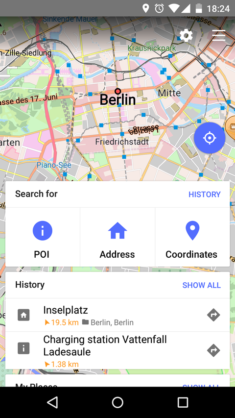
New Map Screen
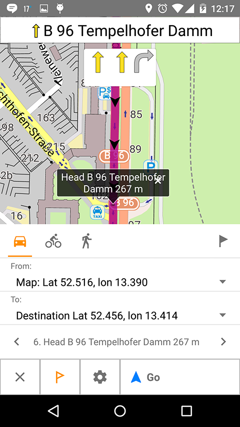
In 1.9 we made first step to simplify Map Screen, it was a hard decision to remove buttons from the top bar and leave more space to the text. After that we realized that many people are missing the "Configure Map" button, so in 2.0 it was our goal to put it back.
We also found out that My location button was hardly searchable by people and we decided to make it bigger as it supposed to be in Material Design. One of the most ambitious step we made, we put on the map screen directions button.
Initially we've thought that might be too many buttons now on the map screen, but so far we found out the new layout makes it cleaner and users get used to these buttons pretty quickly. New Map Screen allows to avoid all other screens in most of the cases, which makes the application more easy to use.
 |  |
|---|
Dashboard (New startup screen)
Initially we had a challenge how to update the startup screen, make it usable, give flexibility to use application before it is fully startup and let users quickly go to the map.
One of the biggest question was and it still exists what should be displayed first a Search or a Map screen. Because OsmAnd is used for Navigation, having a Search screen first has its own logic.
Another argument to display Search options was the time of initializing map, unfortunately it is the most expensive operation, we managed to improve it by 50%, but definitely is not enough. Around 30-40% of this time (unexpectedly for us) is taken by Rendering Style, which improved and improves a lot and as a side effect takes time for initialization. So the answer for 2.0 was to display Search Options with a clear and obvious Transition to the map.
Here we took an idea from Card Layout from Material Design (it is not possible to swipe the cards out yet, but it will come). We liked the idea of cards so much, that it became in the end a control center of the application. Slowly/functionally it took over the list of actions idea, which is simple, descriptive, but not powerful, though we kept it as a fallback option for users who get very familiar with that function.
The dashboard is completely new feature and we are evaluating users feedback. Please give a vote about the dashboard on the main website page.
 |
|---|
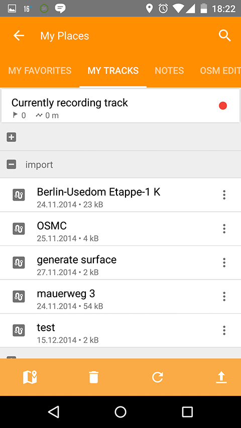
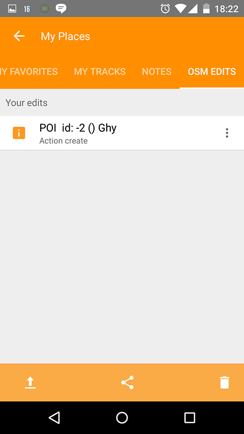
Revised OSM edits implementation
Since version 1 OsmAnd always had some tools for OSM community, we kept support them functionally, but didn't give enough attention to provide better UI and usability. In 2.0 situation has changed, we merged all edits Audio/Video and OSM Edits of POIs/Bugs to My Places activity.
So now it has standard management functions share/export/delete. We also made a default option of modifying POI/OSM Notes offline, so people could make a backup and run upload bulk operation. It will help to improve the quality of created data. We also made a special card for OSM edits in order to quickly upload from Map Screen.
 |
|---|
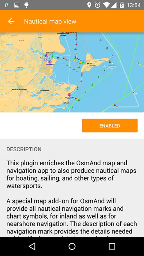
Nautical plugin
There was already an article about Nautical Charts, what is important to mention that this plugin will work only with OsmAnd 2.0 version.
 |
|---|
And remember that only together we can achieve the best results! New features are coming SOON!
Follow OsmAnd on Facebook, TikTok, X (Twitter), Reddit, and Instagram!
Join us at our groups of Telegram (OsmAnd News channel), (EN), (IT), (FR), (DE), (UA), (ES), (BR-PT), (PL), (AR), (TR).

